With the amazing number of bulb varieties in the world it is always a difficult task to decide what to order for our shelves each season, which is why we encourage you to order ahead of time (now) if you want something in particular.
We get 80% of our bulbs from the same vendor and have been doing business with them for over 30 years. We continue this relationship because they can provide the best quality and size bulbs. People always ask if size matters, and the answer is YES! The bigger the bulb, the older the bulb. It is like buying an already established plant in a little package. You get a stronger plant with lots of blooms and instant display. The plants themselves are also more robust, producing more bulblets for more flowers!
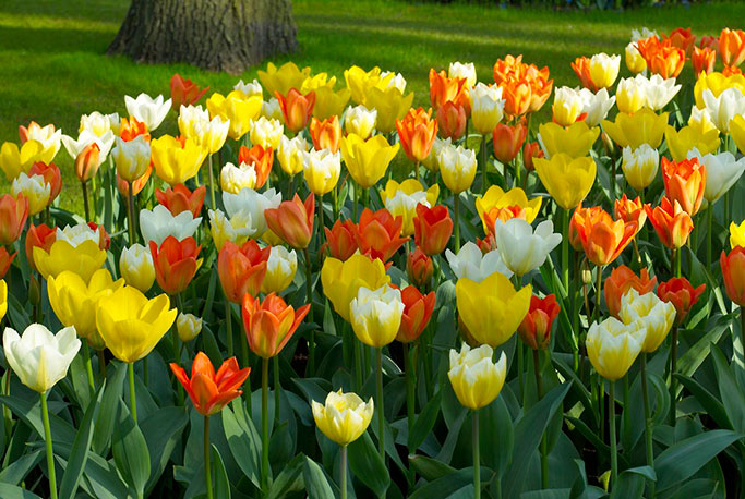
Emperor Tulips
All bulb packages show the bulb size, which is measured in centimeters and references the girth of the bulb at the widest point. When we say a bulb is “top size” that means you are getting bulbs at the high end of the range and you will see that reflected in the garden next season. Your customer will expect a nice display, but how about giving the unexpected - a grand display!
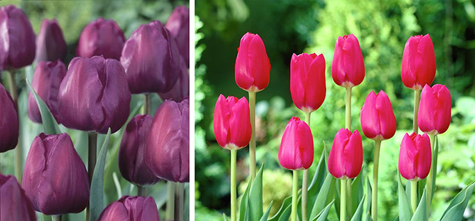
'Negrita' and 'The Cure' Tulips
As you will notice on the bulb mailer we sent out recently, many of our varieties are tried and true and have earned their place as staples. Start with the Emperor tulips, with their large flowers, many colors, and sturdy stems. Another classic choice are Darwin Hybrid tulips. Blooming a little later than the Emperors, they also have strong stems, lots of colors, and are known to perennialize, which can maximize their potential. The dark plum ‘Negrita’ Triumph tulip is another show-stopper - pair it with a pink like ‘The Cure’ or ‘Pink Impression’ and wow!
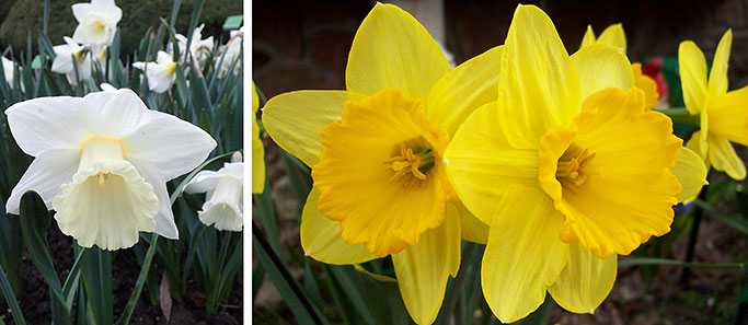
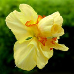
'Mount Hood' and 'Dutch Master' Narcissus
If you are a narcissus fan, you can’t go wrong with ‘Dutch Master’ (yellow), or ‘Mount Hood’ (white). But you can certainly mix it up a little by choosing other varieties in different heights and colors to add some kick or longevity. The white and yellow ‘Ice Follies’ is a gorgeous traditional narcissus that can naturalize and withstands cold, wet spring weather.
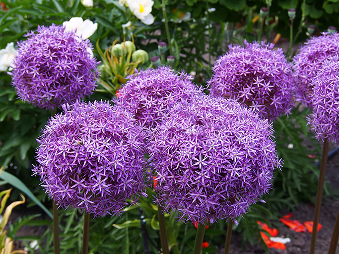
Giant Allium
Everyone must have a giant Allium, of course! Some people look at them as niche, others think of them as truly great performers. Bulbous Alliums require a little patience. They do not look like the picture on day one, but oh… give them time and they will stand up straight at 3’ with massive purple globes.
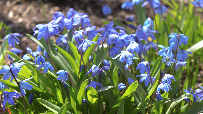
Scillia siberica
Don’t overlook the minor bulbs - not very tall but they get a lot of attention as they are our first look at spring. Many of them naturalize and you haven’t lived until you’ve seen a great sea of blue scilla carpeting the flowerbeds. Crocus large and small, Chionodoxa, Iris, Muscari and the short early narcissus like ‘Tete-a-Tete’ prove themselves year after year.
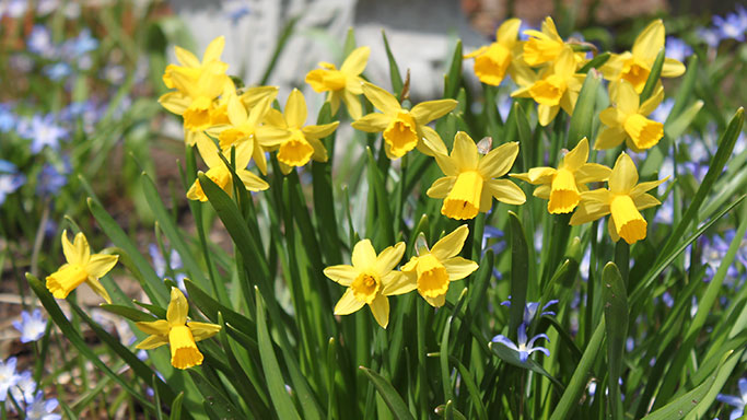
'Tete-a-Tete' Narcissus
If you’re not installing bulbs in your designs, it’s time you did - take your client’s landscapes from wow to POW!

